
Ad Feature
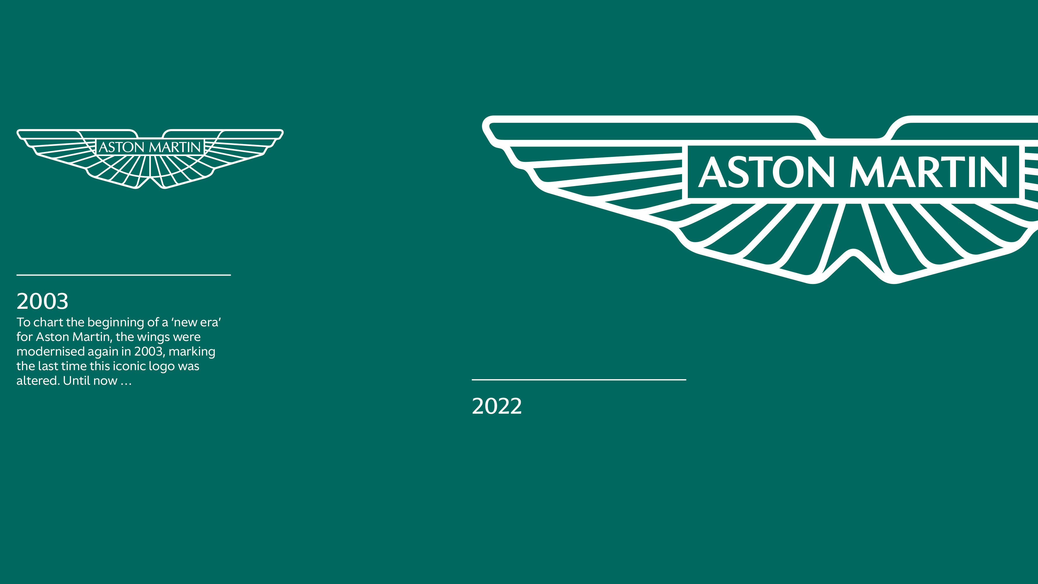
Eighth redesign of the iconic Aston crest seeks younger buyers. Overdoes it.
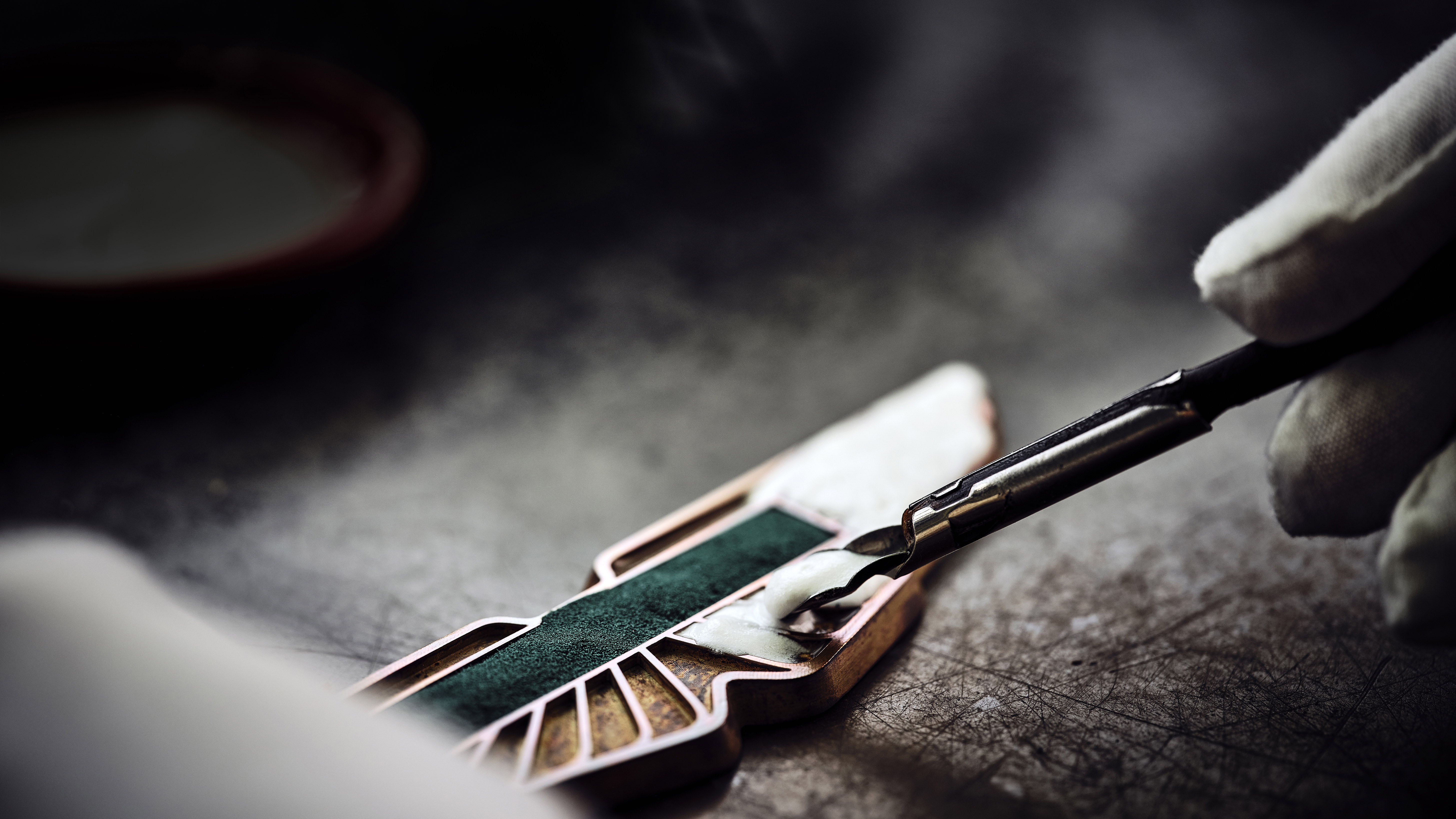
Is it just me, or is this brand new Aston Martin crest a bit, well, toylike? When I first saw it this week, I didn’t think: "oooh, that’s an elegant yet subtle redesign of one of motoring’s most storied badges."
I thought: "oooh, that kinda reminds me of the Fisher-Price logo."
Aston Martin’s press release makes bold claims about the careful and considered update to its badge "accelerating its growth amongst new audiences" and "capitalising on the growing demand from a new generation of Aston Martin customers".
Younger people, basically. It’s supposed to make affluent youths want to spent their trust fund on an Aston. But how young are we talking? Attempting to sell V12 supercars to toddlers is irresponsible and frankly dangerous.
Now, I ought to be fair here and say it’s not just Aston Martin mucking about with Microsoft Paint. Lots of car brands have recently simplified and flattened their badges to give them a new lease of life into the 2020s.
For instance, Audi took its skeuomorphic ‘3D’ badge and removed its sheen, so it looked further away and you didn’t think the brochure was aggressively trying to tailgate you into the downstairs loo.
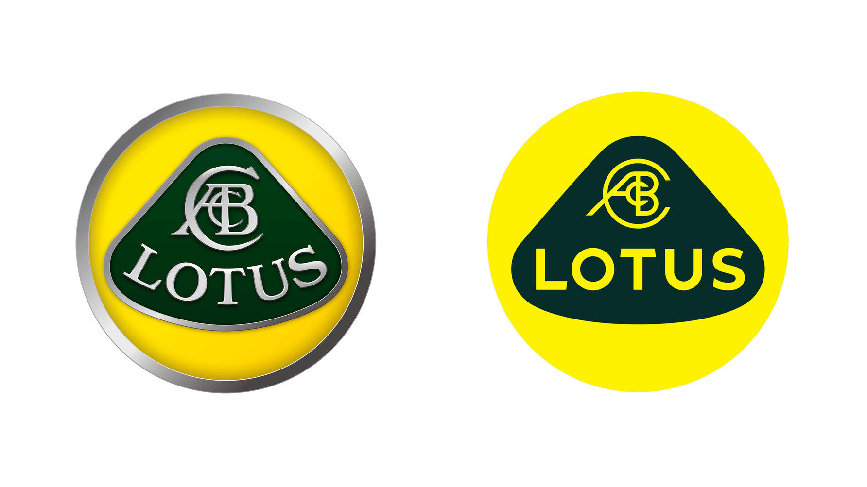
Lotus has also 2D-ified its logo, perhaps to make the new Emira and Evija seem lighter than an Elise. Which they’re not.
And then there was Volkswagen, which applied similar treatment to its VW roundel in 2020 as it tried to rebrand away from the Dieselgate scandal. Whoops. Anyway, the new minimalist logo was designed to show up more clearly on screens, evoking VW’s new ‘digital-first’ ideals, as well as symbolising how the brand was becoming easier to interact with.
All rather ironic really, given every car to wear it so far – the current Golf for instance – is sullied with a dangerously laggy and cheap-looking touchscreen that’s about as ‘digital first’ as a Rubik’s Cube. But harder to use.
Somehow though, all these logos looks more juvenile and toylike than what went before. Don’t ask me why, I’m not a font expert. I learned everything I know about corporate design from that scene in American Psycho where a sweaty Patrick Bateman is comparing business cards with ‘Acquisitions’ spelled incorrectly.
Thank you for subscribing to our newsletter. Look out for your regular round-up of news, reviews and offers in your inbox.
Get all the latest news, reviews and exclusives, direct to your inbox.
I’m just not sure how a slightly less intricate badge opens up the Aston Martin brand to younger buyers. I’m 30 years old, it’s been a whole day since Aston Martin updated its wings and I’m still a couple of hundred grand short of affording a DBS. What gives?
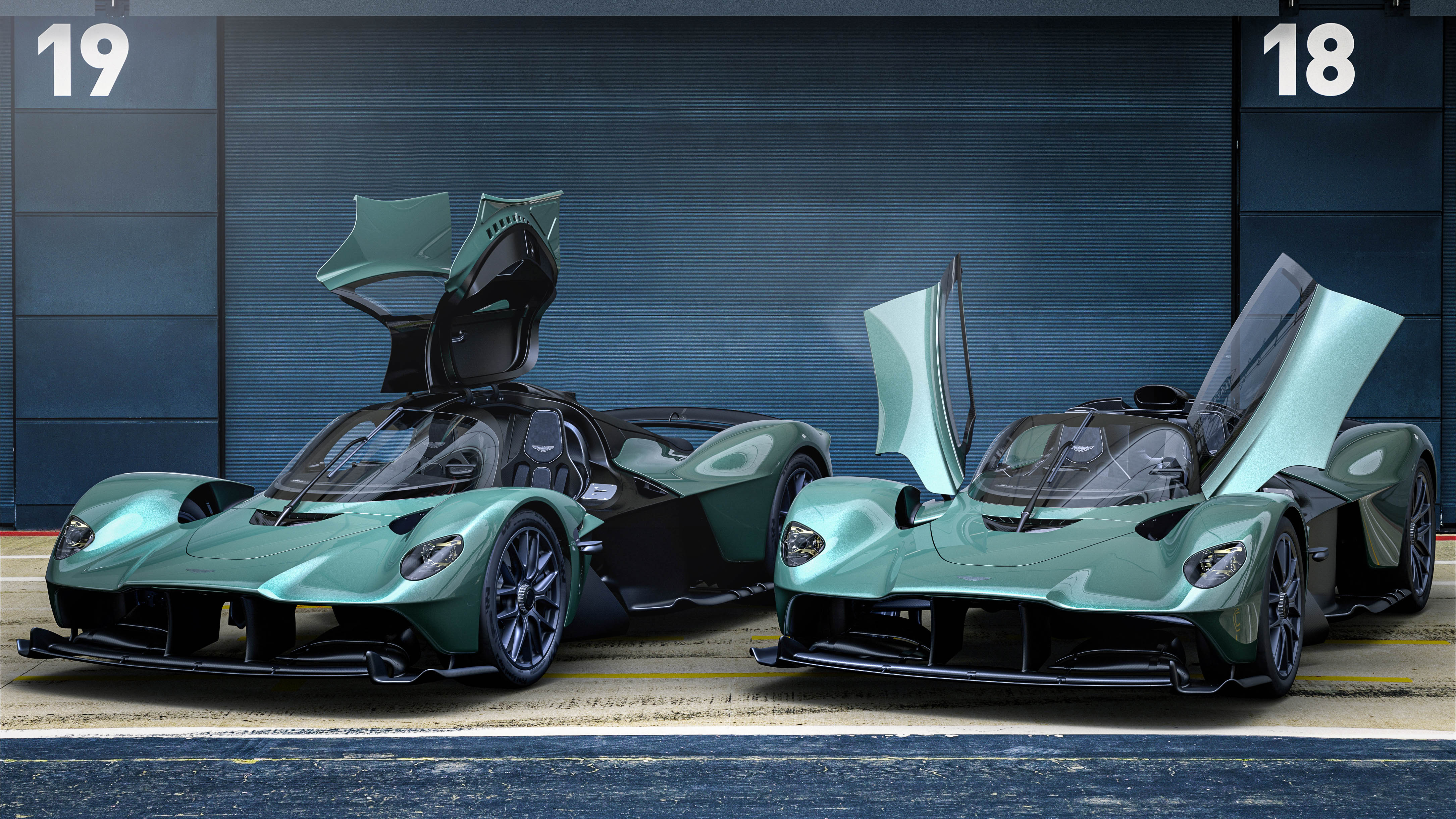
Still, I’m sure it’s deeply gratifying to hear Aston Martin has been very busy splurging time and budget on making its wings look a bit simpler if you’ve been waiting five years for your £2.5million Valkyrie hypercar.
Thank you for subscribing to our newsletter. Look out for your regular round-up of news, reviews and offers in your inbox.
Get all the latest news, reviews and exclusives, direct to your inbox.