


20
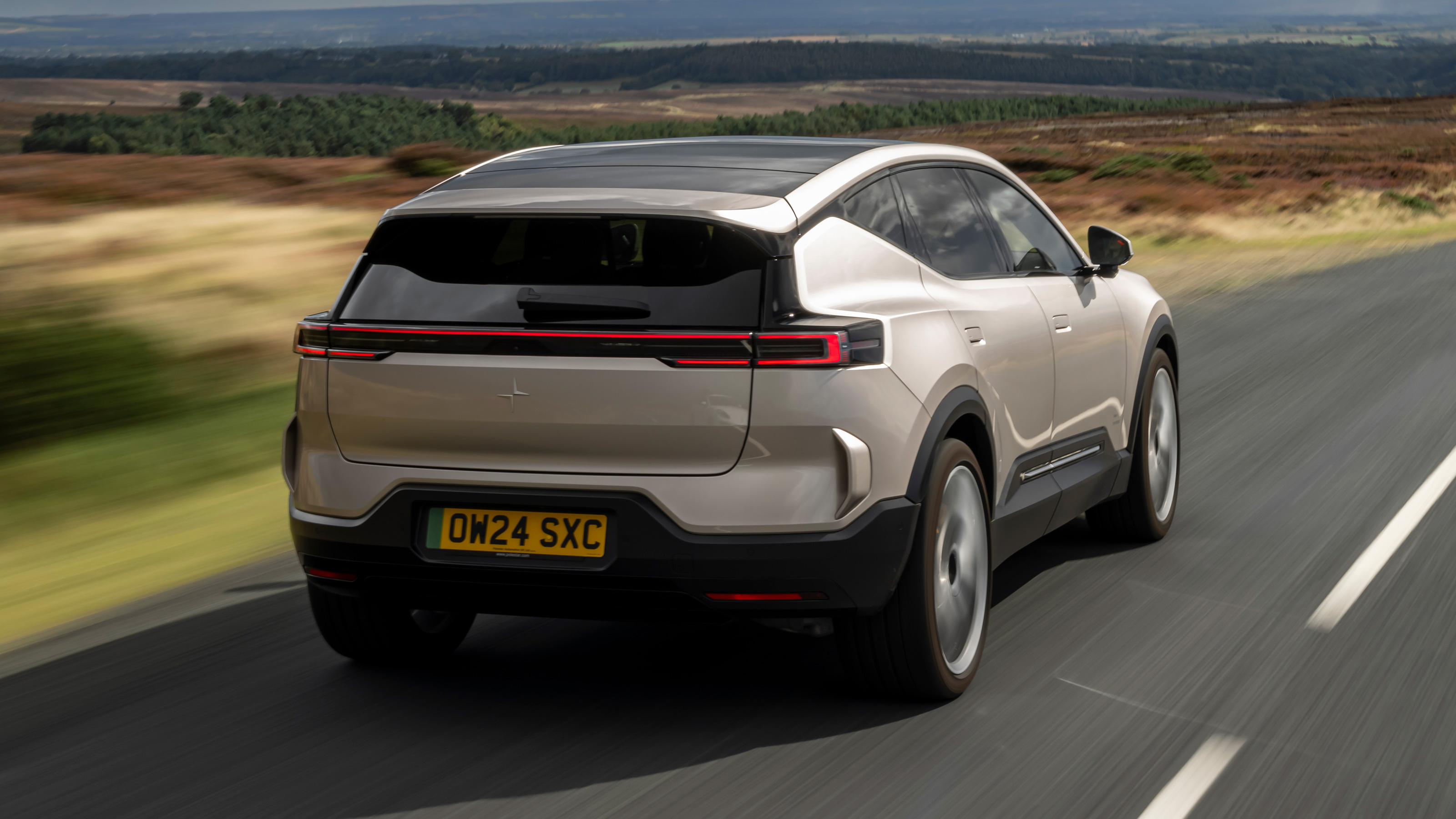
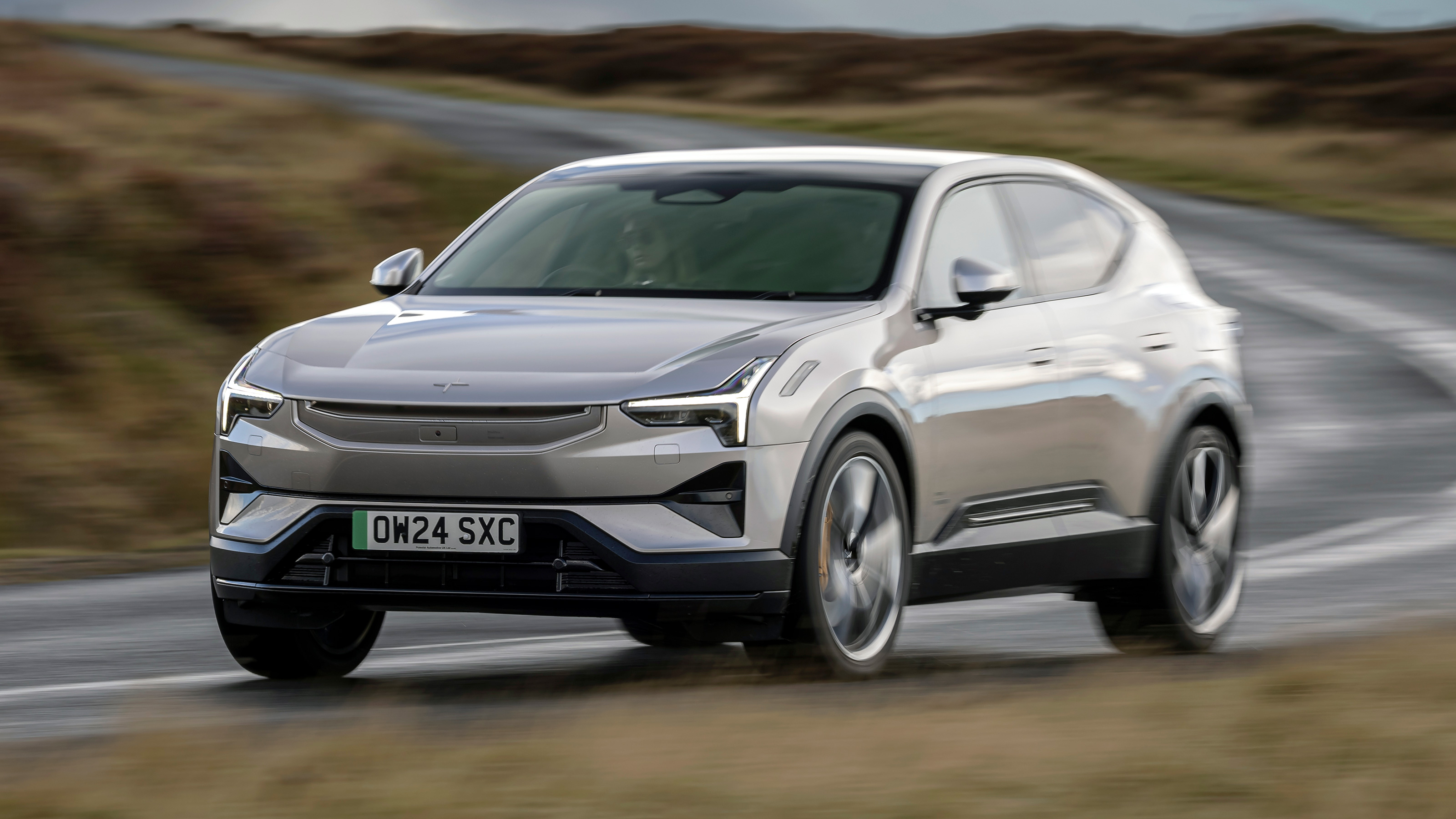
Very Polestar. The design is simply lovely, with gently curving shapes and beautiful use of different textures and materials. The seats are handsome and especially comfortable, and there’s really nice mood lighting.
All the early Launch Edition cars come with a huge panoramic roof, so there’s loads of natural light and a feeling of slightly Scandi wellbeing.
Polestar makes a big deal of its sustainability attempts. That has driven a heavy inclination to recycled materials, but used in a stylish manner. Just to get you used to the terminology, there’s Bio-attributed MicroTech fabric, welfare-secured wool, recycled PET and Econyl (the nylon-esque stuff made from old recycled plastic bottles), repurposed aluminium and again, ‘welfare-secured’ Nappa leather from Bridge of Weir.
Whether all this needs to be labelled self-righteously in various places around the cabin is another matter.
Anyway, the most environmentally costly part of manufacture isn't the trim materials but the CO2 in minerals and metals sourcing, and this is falling. The cradle-to-gate (manufacturing) carbon debt of the Polestar 3 is actually smaller than the Polestar 2 when that was first launched.
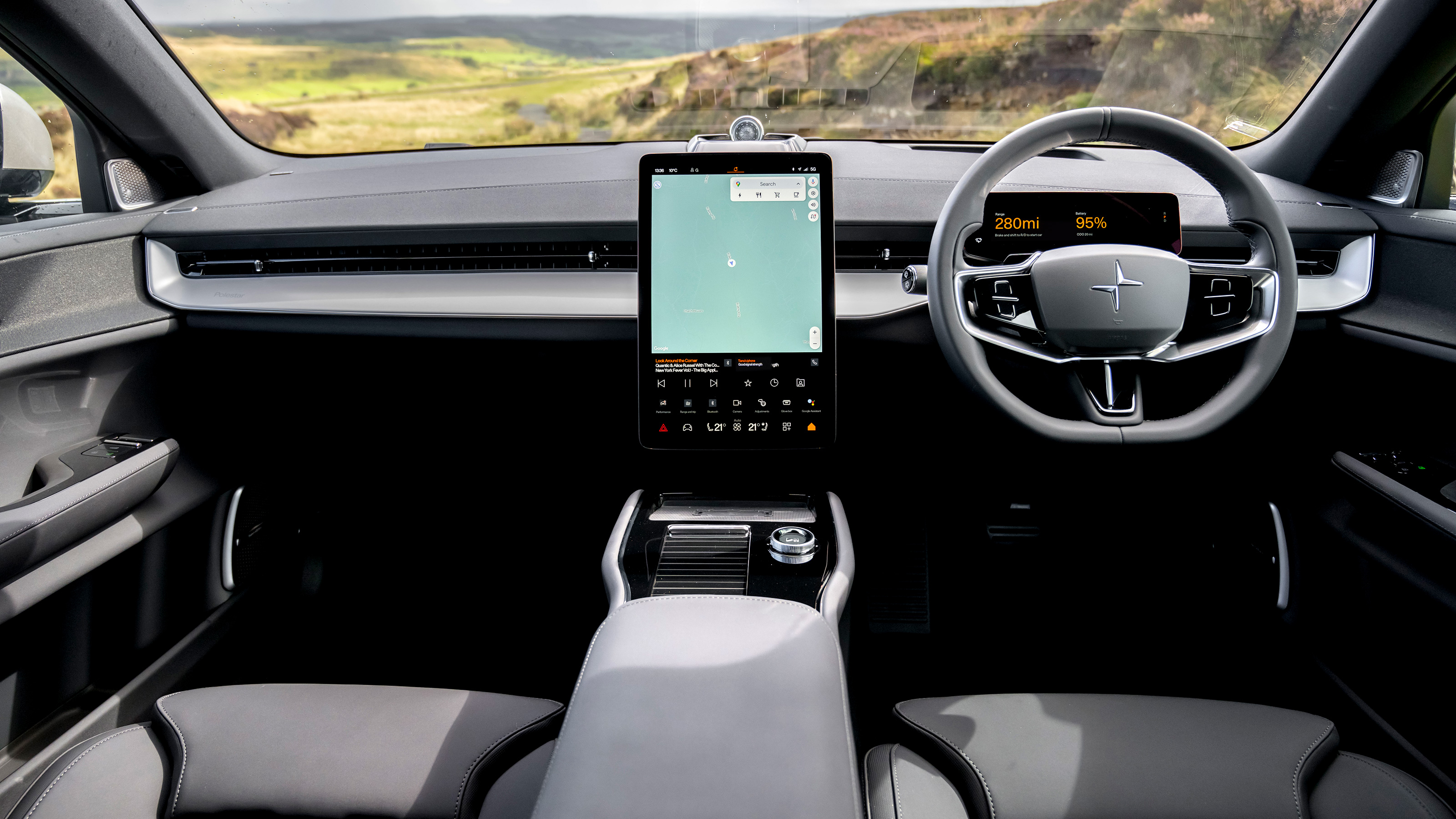
A 14.5in portrait display in the centre console that dominates, with a little driver’s display in front, plus an optional head-up display. The big screen feels slightly out of place; something a little less ‘stuck on’ would be nicer, but you can see why it’s needed.
Android Automotive OS is underlying the operating system, so there’s Google baked in, with all the functionality that brings, and yes, there’s Apple CarPlay. It’s also pretty well connected, running Qualcomm Technologies Snapdragon as a base, so the graphics are crisp and well-rendered. There’s the usual over-the-air updates too, so the P3 should stay up to date.
The issue comes with a lack of physical buttons and poor screen configurability. The big screen is zoned so that certain functions are always in the same place - climate at the bottom, moveable widgets at the top - and you can split the top of the screen according to preference.
But other controls move about confusingly: there's a bar on the screen that's a conveyor of icons for the functions you most recently used. So any given one will change position, and disappear altogether after a time. Which means a lengthy glance off the road as you try to figure it out. Aaargh.
In any case many drive configuration functions and driver-assist systems are buried deep in menus. Hit the little 'car' icon, then a tab, then a drop-down, then the switch you wanted. It can be maddening and feels perilous while you're also trying to, y'know, drive an actual car.
Bottom line, the screen is big but there's far too little scope to let you use its area to set up shortcuts you might want. Interesting to see that the cheaper Polestar 4 – which has a wholly different platform – is much better in this respect.
Very. The packaging takes full advantage of the electric-only platform. The long wheelbase allows for a big shallow battery, giving heaps of rear legroom, and the floor isn't too high, so rear passengers can tuck their feet under the front seats.
It’s a genuinely nice place to be, front or back. Plus there’s loads of places to charge phones and store stuff, and a big dual-level centre console.
Shout out to the Bowers & Wilkins stereo by the way. It’s standard on the first cars, an option on the later ones, but 25-speaker’s-worth of Dolby Atmos goodness. If you like your tunes, you’ll want to option it.
There’s a 484-litre boot, with a useful under-floor bin. It swells to 1,411-litres if you drop the seats, which is fine if not cavernous. There’s also a useful 32-litre frunk.
Oh, and it’ll tow; 750kg unbraked, 2,200kg braked. A switch in the boot deploys an optional electric towbar; another lowers then raises the air suspension to couple the ball hitch.
Thank you for subscribing to our newsletter. Look out for your regular round-up of news, reviews and offers in your inbox.
Get all the latest news, reviews and exclusives, direct to your inbox.
