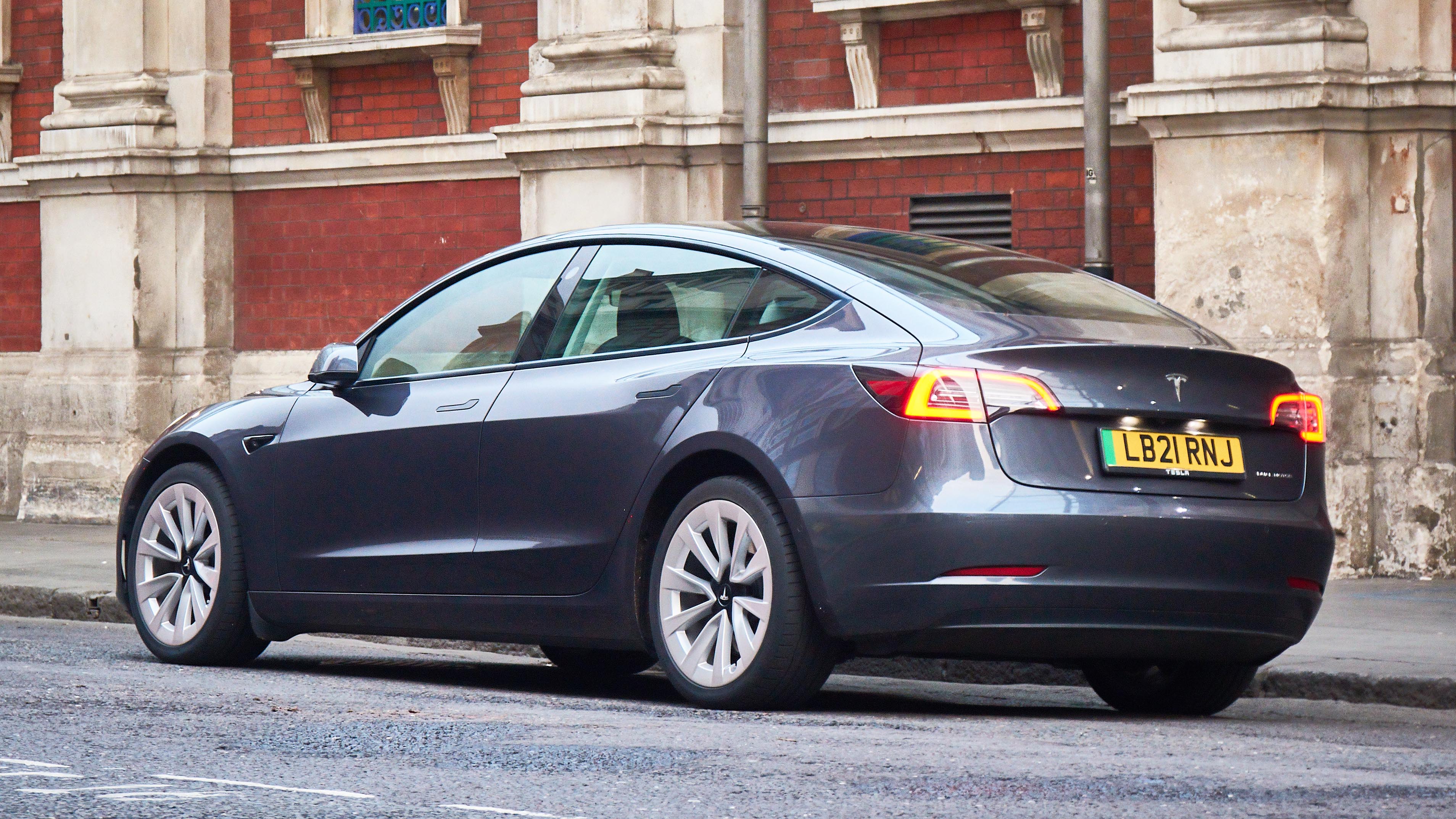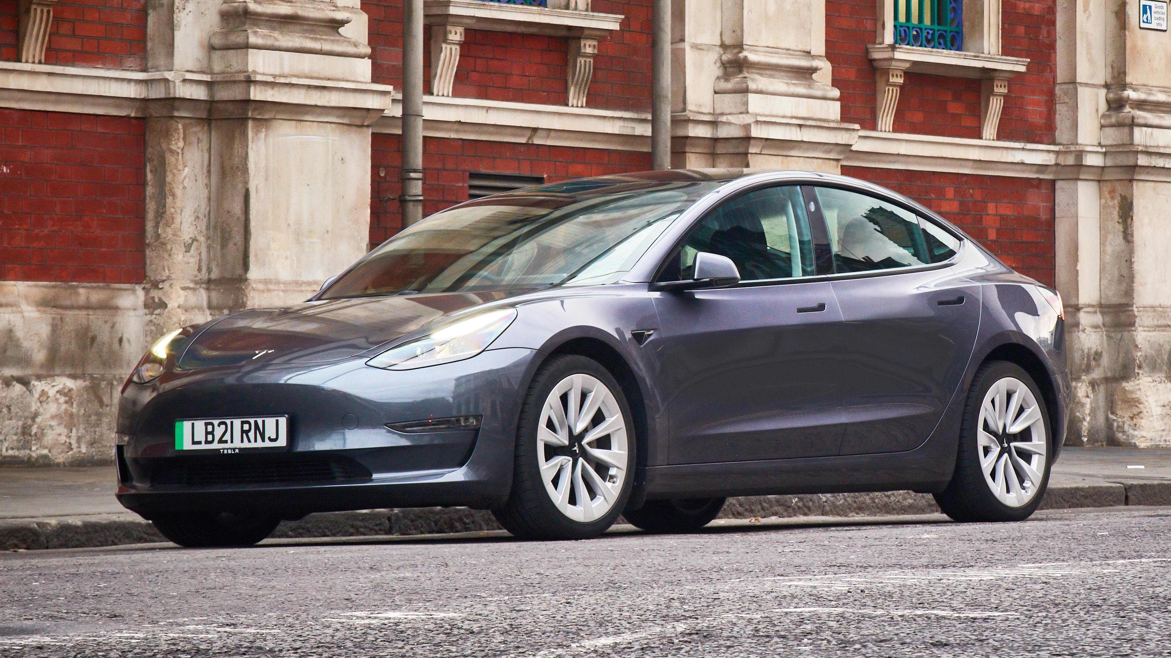
SPEC HIGHLIGHTS
- SPEC
Tesla Model 3
- Range
348 miles
- ENGINE
1cc
- BHP
346bhp
- 0-62
4.5s
Living with a Tesla Model 3: it does the hard stuff well, but fumbles the easy bits
Fresh from its round-trip across France, the Tesla has been handed to me. Jack was most impressed by the flawless supercharger system on that journey, although I have to say I'm finding in other cars that a non-Tesla rapid charging system on UK roads these days loses only by a little to Superchargers in convenience and wins by a lot in coverage.
Soon I'll be going into mid-Wales. There's a big hole in supercharger coverage west of the M5, so it'll be much easier if I use ultra-rapids by at least five other networks that have served me well and don't need apps.
But anyway, the reassurance of Supercharging has made many people switch, via Tesla, to EV. Supercharging isn't the only extremely difficult thing that Tesla has done brilliantly. Its EVs are smooth and efficient and fast and brilliantly packaged, with loads of passenger and storage space. They have robust batteries. Cost has been remorselessly pushed down. For doing all this so well I admire Tesla hugely.
What drives me bananas is the way Tesla screws up the easy stuff, often by re-inventing a wheel that needed no reinvention.
I give you the user interface. It has a large and highly responsive high-definition touchscreen. Hard. It uses an idiotic colour scheme and badly designed graphics and the configuration options are too limited. Stupid errors.
Why does the map's graphic scheme draw white roads on a light-grey background with slightly darker grey place-names? It is, literally, a road map: roads should be the very most obvious and clear thing. If Tesla wanted to preserve the minimalistic monochrome aesthetic, it could have at least used black on white.
Also, the logic is inconsistent. You can touch certain screen text and get a response: touch the battery percentage and it turns to predicted range in miles. But touch the adjacent motor mode text (I use 'chill' for smoother urban driving) and it's not responsive.
Out of town I want the full-power 'standard' mode. But to get that means touching the car icon then the 'dynamics' menu and finally the 'standard ' button. Or a complex dance using the right-hand roller button (long-press, slide-right, roll, short-press). Of course in most EVs, even if you're in the reduced-power mode, you can instantly access full acceleration by a kickdown detent at the end of the pedal travel. Not this one though.
There are similar interface pratfalls in the phone app. To lock the car touch the open-padlock symbol. It turns to a closed padlock. The symbol indicates the current state. Next to it is an open-boot symbol. Ah, so the boot must be open. Nope, in this case the symbol indicates the opposite state to that which currently applies.
That's no biggie of course: you soon learn. But it gives you a nagging feeling the people behind this car aren't half as clever or thorough as they think they are. Are there similar wobbles in the more important stuff too?
Back to the map. You can pinch to zoom but it goes back to its own chosen scale at a junction. Basically, the whole satnav interface assumes that you'll dumbly follow the blue line. Which I hate; I want to see where I am. It also assumes, because the junction arrows are small and a long way out of your sightline because there's no instrument cluster, that you'll have the voice instructions unmuted. Which I also avoid, because I'm listening to something else.
Connectivity is badly lacking too. Tesla, because Tesla knows best, doesn't allow CarPlay or Android Auto. Fair enough in one way, as its route planner takes you via Superchargers and preconditions the battery accordingly. Assuming anyway that the car has a signal, which in much of rural Britain it doesn't. But in most cars you can run the native navigation while also having a couple of bluetooth connections in addition. So I can have my phone connected in case anyone rings, and my kid can be the car DJ off her phone. Not in the Tesla. It's one phone or the other. It can't even play music off a phone connected by USB.
So to the biggest annoyance. One third of the screen, the third nearest to you, is taken up by a rendering of the car's surroundings, synthesised from the cameras' views. Cars, trucks, pedestrians, cyclists, traffic lights and even cones are rendered in near real-time as you pass among them. As I say, Tesla does the hard stuff brilliantly. It's magical.
It is also mostly worse than useless. Why would you be looking at the screen and not the actual road? And yes, it does sometimes miss huge obstacles. "I hit it because it didn't show up on the screen…" Try that with the magistrate.
Also this flickering virtual roadscape is a terrible distraction. I'd much rather get rid of it and use that screen real-estate for something useful, like drive setting or mode switches, or a speedometer big enough to see at a glance.
By the way, on my first motorway journey I kept getting error messages that the side cameras, first the right and then the left, were 'blocked or blinded'. Not blocked: the car was sparkly clean. And if blinded in late-September Britain, how would they cope in sunny California?
Featured

Trending this week
- Car Review
BMW iX3


